
It’s no secret that mobile web browsing has surpassed desktop browsing. In fact, more than ever before, people are using their phones to browse, book, buy, and more, and for your business to make an impact, it’s essential to create a responsive web design that not only is visually stunning but also adapts to fit any size screen.
Not only will users get a better experience, but you’ll also save time and money on maintaining separate pages and your site will benefit from better Google Analytics. Why? Your site’s usage from mobile and desktop will now be combined.
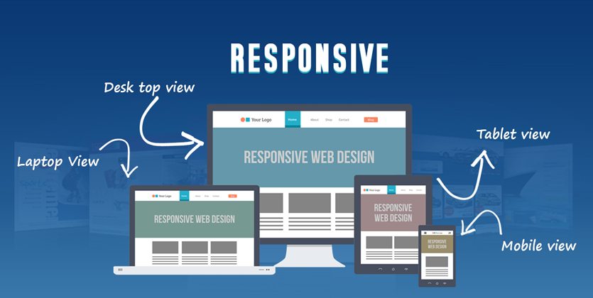
As you plan to design or redesign your site with a responsive web design, here are our Top 4 do’s and don’ts to make your site mobile friendly.
The Do’s
- Design Mobile First: When designing your site, design a site for mobile then scale it up for tablets and desktops. Trust us, this makes everything easier.
- Use Large Fonts: Most users read desktop content in a 12-point font. The problem? That’s too small for mobile. But the solution is simple: increase your smallest font that may seem to look too big for desktops and see how it looks on mobile. As rule of thumb, your font size should be no smaller than 16 points. Go from there.
- Use Adaptive Images: Essentially, this means that images will replace themselves when different screen sizes are used, which will lead to faster load times. Optimize your images and users will see them perfectly no matter which screen they’re on.
- Keep the User in Mind: A given, right? But sometimes what we think works doesn’t work for the user. Test it and retest it to make sure users are getting the experience you want them to have.
The Dont’s
- Clutter the Design: Multiple navigation planes, multiple sidebars— these may not be noticeable on desktop but will most likely clutter the mobile experience. Keep your designs clear and clean and get rid of anything you don’t absolutely need.
- Use Tiny Links: A mouse is accurate, a finger is not. Keep this in mind when inputting links. Keep your body font size at least 16px and your line height at least 1.4.
- Ignore the Touch: Remember, mobile users are on touch screens. Make links larger and more easily pushable, and design touch targets that will work with an average finger—not too small but not too large. Test with different size fingers.
- Bury Your Content: Users want to see the same content on mobile as what they see on the website. That doesn’t mean you have to fit it all on a smaller screen. Try the hamburger menu—the three tiered menu usually found at the top of the screen (Wikipedia uses this effectively).
Looking to focus on the do’s and avoid the don’ts? Liqui-Site’s team of web design experts can help you build a visually stunning, compelling, and responsive website. Contact us today!